Description
During 2004 and 2005, I developed a comprehensive packaging and branding system for a client specializing in both sweet and savory tea biscuits and linzers.
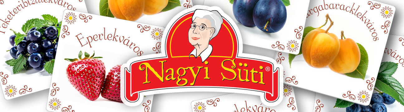
For this project, I created the logo to reflect the brand’s homemade quality and welcoming character. Using a warm red background and a friendly script, I used a grandmotherly figure to symbolize tradition and trust.
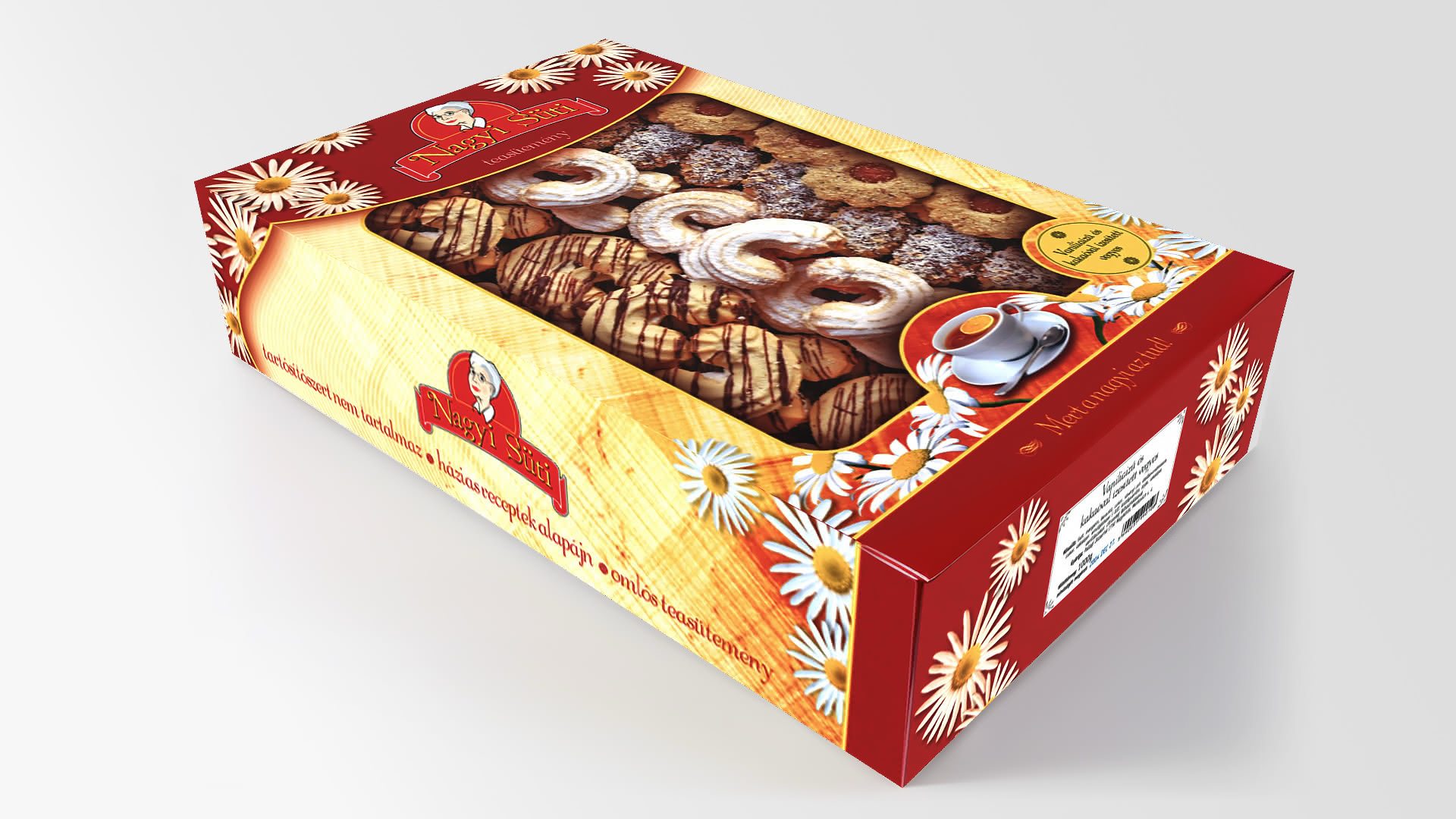
cardboard box (click to enlarge)
I also had to design a range of product labels, flavor variant stickers, and both plastic and paper packaging solutions, integrating clear windows to showcase the product inside.
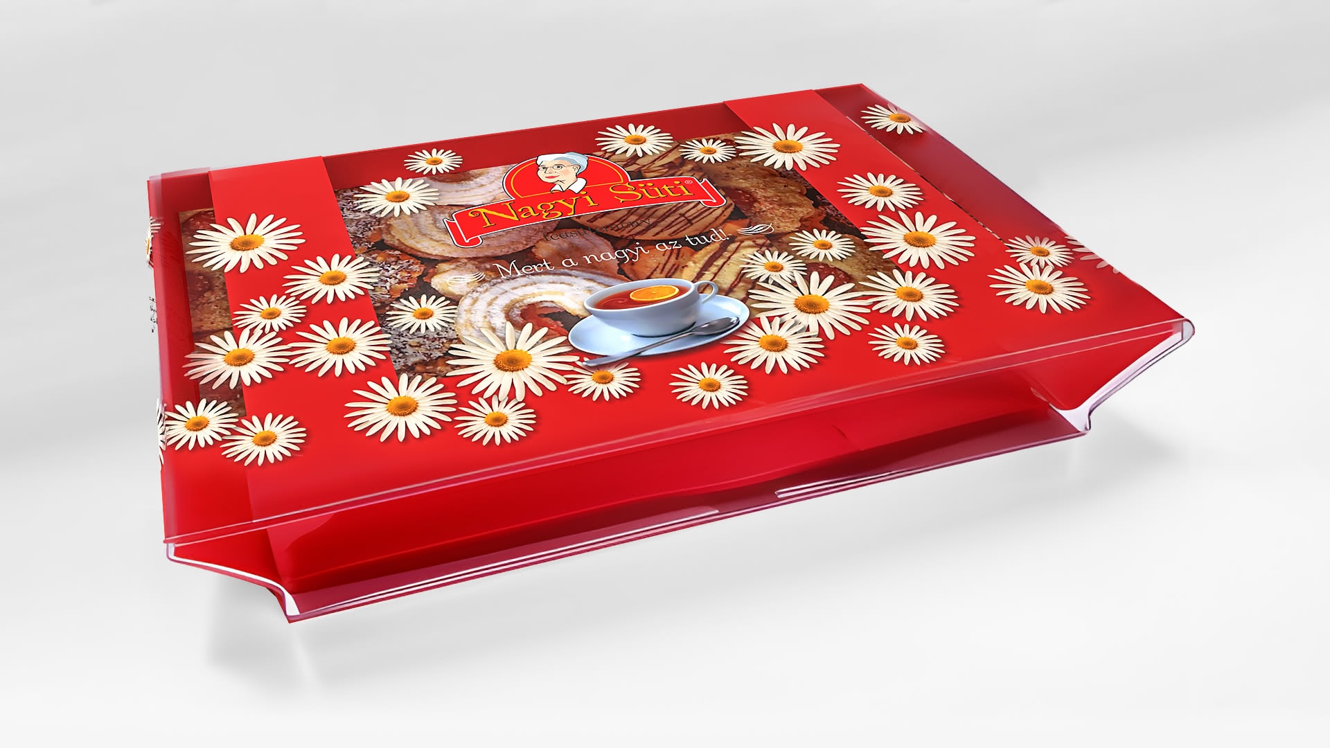
tray with plastic wrapper (click to enlarge)
From a desktop publishing perspective, special attention was required to maintain print fidelity across different substrates –plastic, paper, and adhesive labels – while ensuring that branding elements remained legible and visually appealing in both large and small formats.
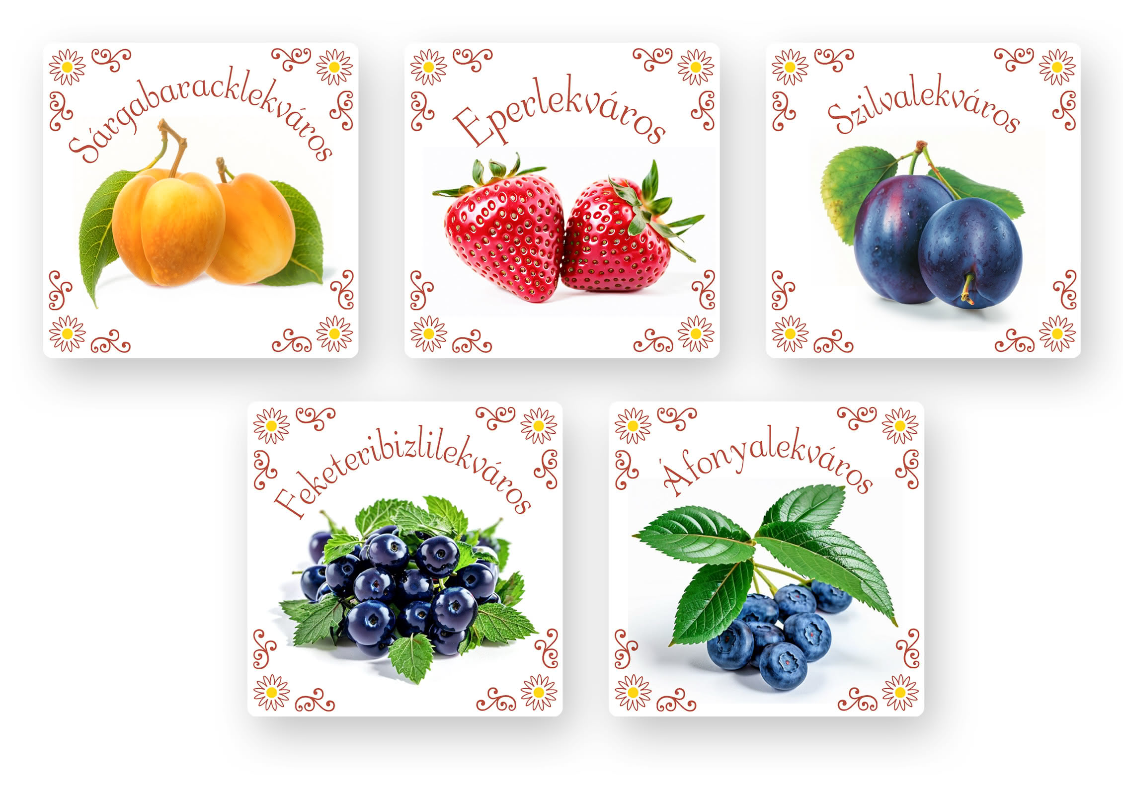
flavor variant stickers (click to enlarge)